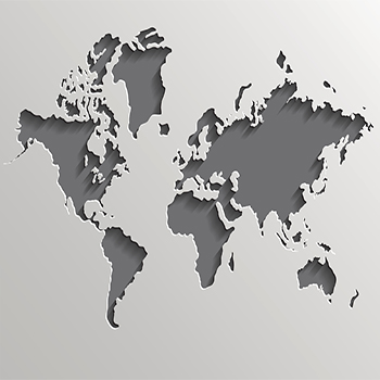
Mapping Supply Chains in the Global Economy
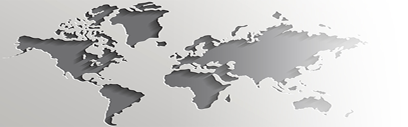
We all know that supply chains are becoming more and more global, but how often can we actually see them becoming more global?
Mapping is creating graphic representations of information using spatial relationships within the graphic to represent some relationships within the data.
The common and original practice of mapping is the scaled portrayal of geographical features, that is, cartography.
In the contemporary sense of data visualization, it includes metaphorical extensions of geographical map conventions and literacies to other kinds of data, as well as innovative ways of visualizing data not clearly related to the geographical archetype. In popular vernacular, mapping can just mean organizing or systematizing information.
The site vox.com has compiled 38 maps that explain the global economy. TeleGeography’s interactive Submarine Cable Map is based on their authoritative Global Bandwidth research, and depicts active and planned submarine cable systems and their landing stations. Sourcemap is the first crowdsourced directory of supply chains and environmental footprints. We’ve selected some that are especially relevant to today’s global supply chains.
World Shipping Routes
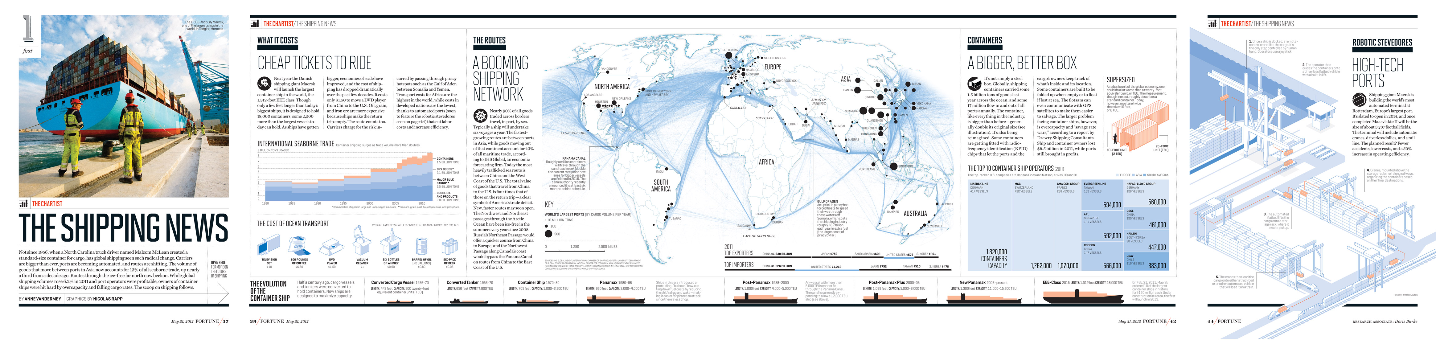
Nicholas Rapp made this beautiful image of global shipping routes, highlighting the sinews of commerce in the modern age as global trade has boomed to unprecedented levels. Trade as a share of world output fell precipitously during the two world wars, and Cold War politics kept it relatively low for most of the second half of the twentieth century. But over the past generation it’s boomed, thanks to a combination of changed policies and the invention of the container shipping.
Busiest Container Ports
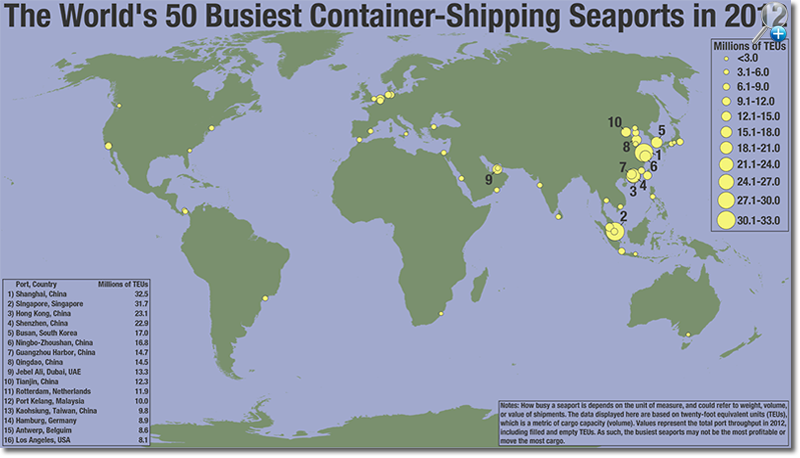
Seaports are a physical manifestation of the global trade of goods. This Seth Kadish map shows the locations of the 50 busiest on the planet, and the size of the dots is scaled to the quantity of goods they handle. The heavy concentration of shipping activity on Asia’s Pacific Coast is a striking symbol of both East Asia’s enormous population and its outsized role in the global manufacturing sector.
World Export Map
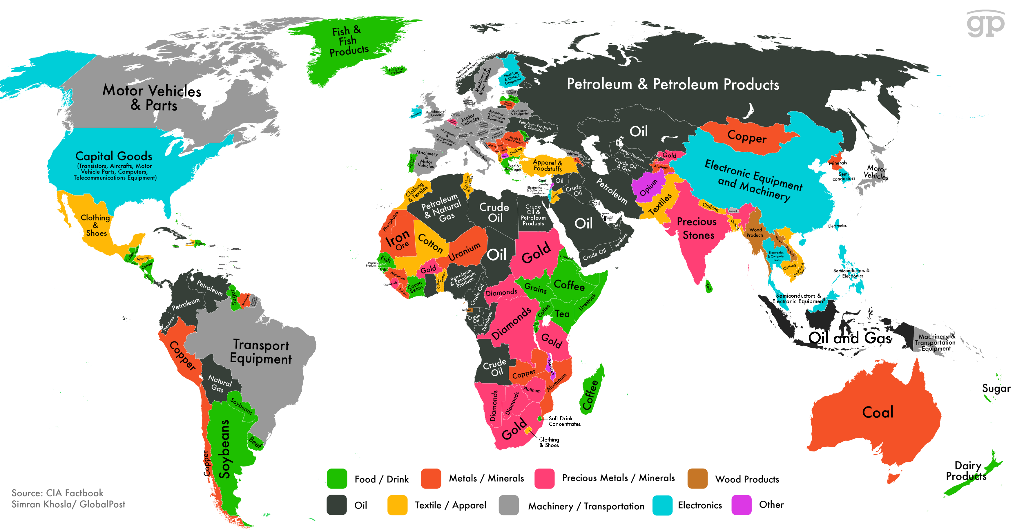
This map from Simran Khosla charts each country’s biggest export category, and also color-codes the categories into larger groups. Countries that depend on metal or mineral exports are typically quite poor, with the dominance of these sectors generally a tell-tale sign of a lack of any kind of sophisticated industrial base.
How Sugar Circulates The Globe
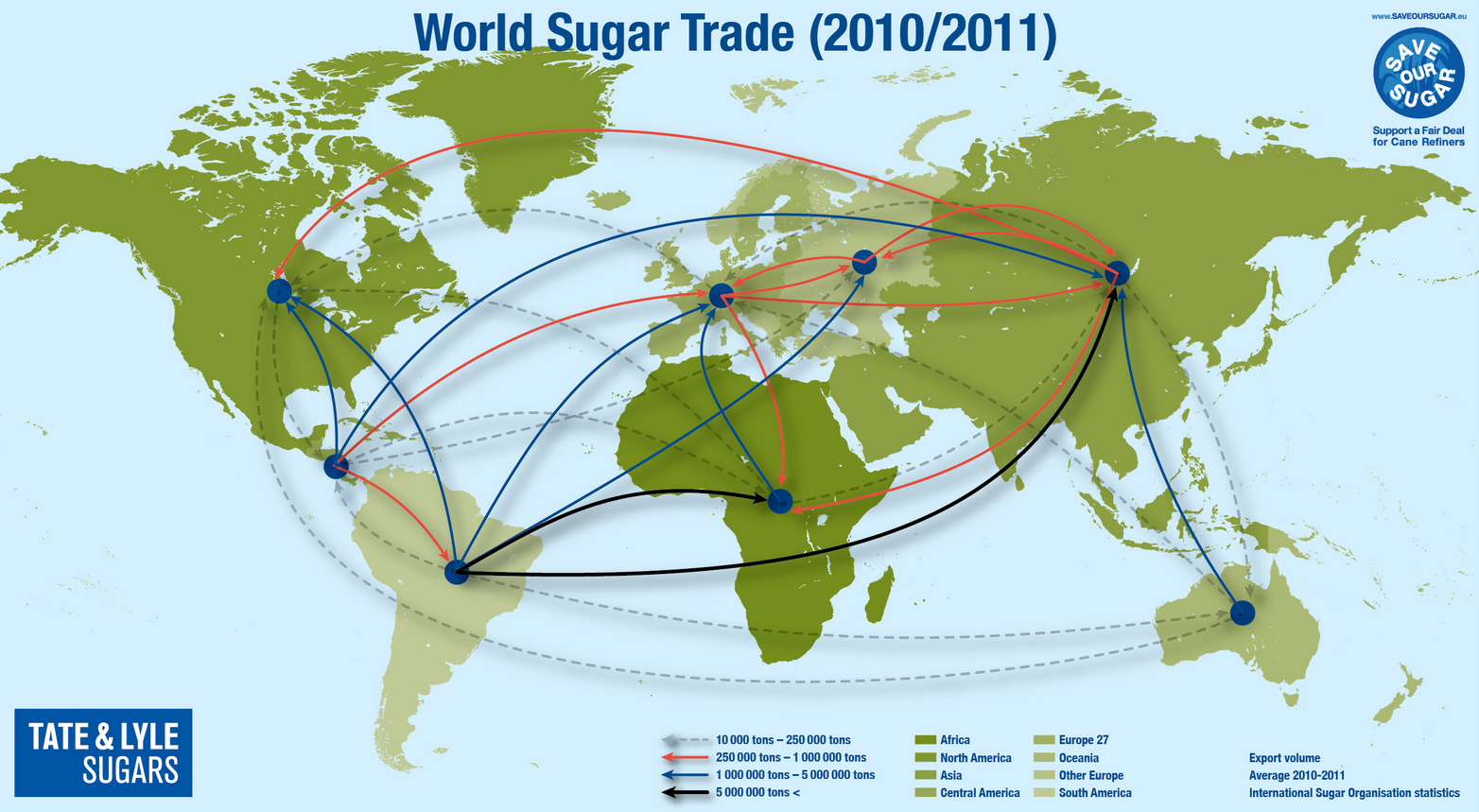
Sugar isn’t necessarily the most important commodity in the world, but it is one of the most widely consumed and delicious. This Tate & Lyle sugars map illustrates the global pattern of sugar imports and exports — a surprisingly complex web that reveals the ways in which the real-world pattern of global trade is considerably more tangled than a basic model of specialization and comparative advantage would suggest.
Megacities & World Population
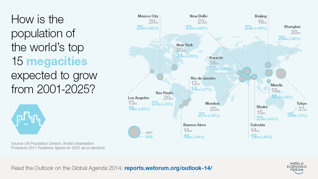
We are living through an era of massive urbanization in many of the largest-population cities of the world. This map from the World Economic Forum charts the world’s biggest metropolitan areas and forecasts their likely growth from 2001 to 2025.
Apple iPhone Supply Chain

Apple more than most is a master at using the supply chain to its advantage, sourcing suppliers that can turn out parts in the most cost effective way whilst still adhering to the company’s quality requirements.
TeleGeography’s Submarine Cable Map
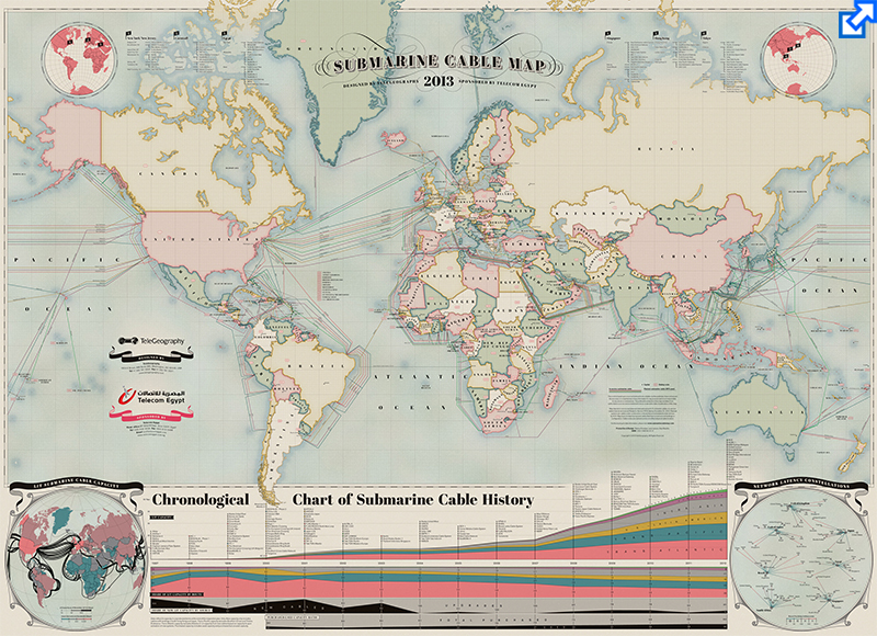
If you’re reading this post right now, odds are good that you’re one of millions upon millions of people who access the Internet each day from around the world. We constantly see data that has been delivered to our PCs and mobile devices over the Internet, but rarely do we stop to think about the complex network that feeds that data to our devices.
There are numerous integral components in this massive network, but one of the more interesting elements is the web of cables laid beneath the Earth’s oceans that connect networks on each continent. TeleGeography’s Submarine Cable Map provides an interactive look at this huge global network of undersea cables
These maps are our favorite way to illustrate the major economic themes facing the world today. Some of them focus on the big picture while others illustrate finer details. The overall portrait that emerges is of a world that’s more closely linked than ever before, but still riven by enormous geography-driven differences.
Related: What Does Your Global Supply Chain Look Like From 30,000 Feet? Map It
For more about how the supply chain is changing, download the new whitepaper, “Supply Chain’s New World Order”, which discusses the cloud, S&OP, and why a holistic approach is needed for supply chain management.
Download the White Paper: Supply Chain’s New World Order
Article Topics
One Network Enterprises News & Resources
Blue Yonder announces an agreement to acquire One Network Enterprises for $839 million Blue Yonder Acquires One Network Enterprises for $839M Companies Need to Develop New Innovative Approaches to Supply Chain Design How to Improve Cost of Goods Sold Horizontally Across the Supply Chain How the Global Pandemic Accelerated Supply Chain Visibility, Digitalization, and Automation AI and Data, the Future of Supply Chain Management AI and Supply Chain Problem Solving More One Network EnterprisesLatest in Supply Chain
Microsoft Unveils New AI Innovations For Warehouses Let’s Spend Five Minutes Talking About ... Malaysia Baltimore Bridge Collapse: Impact on Freight Navigating TIm Cook Says Apple Plans to Increase Investments in Vietnam Amazon Logistics’ Growth Shakes Up Shipping Industry in 2023 Spotlight Startup: Cart.com is Reimagining Logistics Walmart and Swisslog Expand Partnership with New Texas Facility More Supply Chain